Visualization Element: Cartesian XY Chart
Symbol:

Category: Special Controls
The element graphically displays the curve of array values as a line or bar chart in the Cartesian coordinate system. The chart can display multiple curves at one time.
Note
 Sample project: "Visu Element XY Chart Example"
For more information, see the following: Example: Cartesian XY Chart
Restriction
The element can be used with controller with V3.5 SP11 and higher.
If a Cartesian XY Chart is displayed on more than 20 WebVisu clients, then the following warning will appear in the device log:
Cartesian XY Chart: Not enough memory in the PLC to create the client.
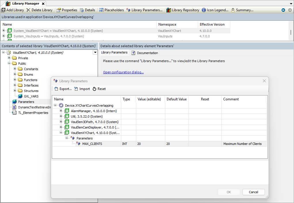
The library
System_VisuElemXYChartprovides the parameterMAX_CLIENTS. By default, this is set to 20, but you can change it.For more information, see the following: Library Parameters
Element properties
Are all element properties available?
All properties are available only after you select the Advanced option or the All categories filter in Properties.
Element name | Example: Name assignmentAssign individual names for elements so that they are found faster in the element list. |
Type of element | Cartesian XY Chart |
Cartesian XY Chart |
There you can configure the chart. |

Position
The position defines the location and size of the element in the visualization window. This is based on the Cartesian coordinate system. The origin is located in the upper left corner of the window. The positive horizontal X-axis runs to the right. The positive vertical Y-axis runs downwards.
X | The X-coordinate (in pixels) of the upper left corner of the element Example: |
Y | The Y-coordinate (in pixels) of the upper left corner of the element Example: |
Width | Specified in pixels Example: |
Height | Specified in pixels Example: |
Tip
You can change the values by dragging the box  symbols to other positions in the editor.
Element appearance
The properties contain fixed values for defining the look of the element.
Border line width | Value (in pixels) Example: Note: The values |
Border line style |
|
Frame line color |
|
Font axes
Font | Example: Default
|


Control variables
Zooming the displayed curve is done by means of the mouse, or the pinch gesture on a multitouch device. It also applies to all axes. At runtime when Enable is Zooming and panning can work together. | |
Activate | Variable (
Example: |
Home | Variable ( Rising edge: Reset the displayed curve to the initial state after the display has changed due to zooming. Example: |
Undo | Variable ( Rising edge: Reset the displayed curve to the previous position after the display has changed due to zooming. Example: |
Is zoomed | Variable (
Example: |
Panning the displayed curve is done by means of the mouse or the pinch gesture on a multitouch device. It also applies to all axes. At runtime if Enable is | |
Activate | Variable (
Example: |
Home | Variable ( Rising edge: Reset the displayed curve to the initial position after the display has changed due to panning. Example: |
Is panned | Variable (
Example: |
Absolute movement
The properties can be assigned to IEC variables for controlling the position of the element dynamically. The reference point is the upper left corner of the element. At runtime, the entire element is moved.
Movement | ||
X |
Increasing this value at runtime moves the element to the right. | |
Y |
Increasing this value at runtime moves the element downwards. | |
Rotation | Variable (numeric data type) for the angle of rotation (in degrees) Example: The midpoint of the element rotates at the Center point. This rotation point is shown as the At runtime, the alignment of the element remains the same with respect to the coordinate system of the visualization. Increasing the value rotates the element to the right. |  |
Interior rotation | Variable (numeric data type) for the angle of rotation (in degrees) Example: At runtime, the element rotates about the point of rotation specified in Center according to the value of the variable. In addition, the alignment of the element rotates according to the coordinate system of the visualization. Increasing the value in the code rotates clockwise. The rotation point is shown as the NoteIf a static angle of rotation is specified in the property, then the static angle of rotation is added to the variable angle of rotation (offset) when the visualization is executed. |  |
Tip
You can combine the variables to a Unit conversion.
Tip
The X, Y, Rotation, and Interior rotation properties are supported by the "Client Animation" functionality.
State variables
The variables control the element behavior dynamically.
Invisible | Variable (
Example: |
Deactivate inputs | Variable (
|
Tip
The Invisible property is supported by the "Client Animation" functionality.
Center
The properties contain fixed values for the coordinates of the point of rotation. The rotation point is displayed in the editor as the  symbol and is used as the center for rotation and scaling.
Tip
You can also change the values by dragging the symbol to another position in the editor.
X | Editable X-coordinate of the point of rotation Double-clicking in the value field will open the line editor. |
Y | Editable Y-coordinate of the point of rotation Double-clicking in the value field will open the line editor. |
Animation
Tip
These properties are available only when you have selected the Support client animations and overlay of native elements option in the Visualization Manager.
Animation duration | Variable for the duration (in milliseconds) in which the element runs an animation
. Animatable properties
The animated movement is executed when at least one value of an animatable property has changed. The movement then executed is not jerky, but is smooth within the specified animation duration. The visualization element travels to the specified position while rotating dynamically. The transitions are smooth. |
Move to foreground | Variable (
Example: |
Permissions
Note
Available only when a user management is set up for visualization.
Access Rights button | Opens the Access Rights dialog. There you can edit the access privileges for the element. . Status messages:
|