Visualization Element: Pie
Symbol:

Category: Basic
The element draws a pie of any angle.
Element properties
Are all element properties available?
All properties are available only after you select the Advanced option or the All categories filter in Properties.
Element name | Example: Name assignmentAssign individual names for elements so that they are found faster in the element list. |
Element Type | Pie |
Position
The position defines the location and size of the element in the visualization window. This is based on the Cartesian coordinate system. The origin is located in the upper left corner of the window. The positive horizontal X-axis runs to the right. The positive vertical Y-axis runs downwards.
X | The X-coordinate (in pixels) of the upper left corner of the element Example: |
Y | The Y-coordinate (in pixels) of the upper left corner of the element Example: |
Width | Width (in pixels) Example: |
Height | Height (in pixels) Example: |
TipYou can change the values by dragging the box | |
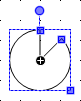
Angle | Static angle of rotation (in degrees) Example: The element is displayed rotated in the editor. The point of rotation is the center of the element. A positive value rotates clockwise. TipHint: You can change the value in the editor by focusing the element to the handle. When the cursor is displayed as a  (1): Handle NoteIf a dynamic angle of rotation is also configured in the property, then the static and dynamic angles of rotation are added at runtime. The static angle of rotation acts as an offset. |


Variable
Begin | Start angle of the pie If you also define a variable for the start, then the start angle is calculated from the sum of the values for Begin and Variable for begin. | . Example:
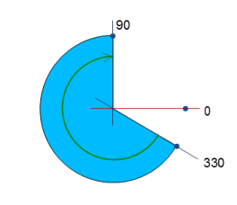 |
End | End angle of the pie If you also define a variable for the end, then the end angle is calculated from the sum of the values for End and Variable for end. The pie is drawn clockwise from the start angle to the end angle. | |
Variable for begin | The start of the sector is defined dynamically by a variable. | |
Variable for end | The end of the sector is defined dynamically by a variable. | |
Only show circle line |
| |

Center
X | Display of the center coordinates. NoteYou cannot modify these values here in the properties. If the pie is selected in the editor, then the center of the pie (as well as the center of the enveloping box) is displayed with the
|
Y |


Colors
Normal state | The normal state is in effect if the variable in is not defined or it has the value |
Frame color | Frame and filling color for the corresponding state of the variable |
Filling color | |
Transparency | Value (0 to 255) for defining the transparency of the selected color 255: The color is opaque. 0: The color is completely transparent Read-only transparencyThe property is read-only when the color is a style color with a predefined transparency value. |
Alarm state | The alarm state is in effect if the variable in has the value |
Use gradient color |
|
Gradient setting | The Gradient Editor dialog opens. |
Appearance
The properties contain fixed values for setting the look of the element.
Line width | Value (in pixels) Example: NoteThe values |
Fill attributes | How the element is filled
|
Line style | Type of line representation
|
Tip
You can assign variables in the Appearance variables property for controlling the appearance dynamically. The fixed values here are overwritten.
Texts
Text | String (without single straight quotation marks) Example: The element is labeled with this text. If a placeholder |
Tooltip | String (without single straight quotation marks) Example: The text is output as a tooltip. If a placeholder |
Tip
Use the Ctrl + Enter shortcut to add a line break.
Tip
The specified texts are automatically transferred to the GlobalTextList text list. Therefore, these texts can be localized.
Text properties
The properties get fixed values for the text properties and are applied to the texts configured in the Texts → Text or Texts → Tooltip properties.
Horizontal alignment | Horizontal alignment of the text within the element |
Vertical alignment | Vertical alignment of the text within the element |
Text format | . Definition for displaying texts that are too long
|
Font | Example: Default
|
Font color | Font color in the normal state Example: Black
|
Font alarm color | Font color which is active in the alarm state ImportantIt must differ from the font color in the normal state. Example: Red |
Transparency | Integer (value range from The transparent value determines the transparency of the respective color.
Read-only transparencyThe property is read-only when the color is a style color with a predefined transparency value. |


Absolute movement
The properties contain IEC variables for controlling the position of the element dynamically. The reference point is the upper left corner of the element. At runtime, the entire element is moved.
Movement | ||
X |
Increasing this value at runtime moves the element to the right. | |
Y |
Increasing this value at runtime moves the element downwards. | |
Scaling | Variable (integer data type) to trigger a centric stretching Example: The reference point is the Center property. The value | |
Interior rotation | Variable (integer data type) for the angle of rotation (in degrees) Example: At runtime, the element rotates about the point of rotation specified in Center according to the value of the variable. In addition, the alignment of the element rotates according to the coordinate system of the visualization. Increasing the value in the code rotates clockwise. The rotation point is shown as the If a static angle of rotation is specified in , then the static angle of rotation and the angle of rotation are added. |  |
Tip
You can combine the variables to a Unit conversion.
Tip
The X, Y, and Interior rotation properties are supported by the "Client Animation" functionality.
Text variables
Text variable | Variable (data type conforming to the formatting specification) for the placeholder in the Texts → Text property Example: The variable value replaces the placeholder in the text of the element. At runtime, the element is labeled with the text, and the variable value is constantly updated. NoteIf you specify a variable of type enumeration with text list support, then the name of the enumeration data type is added automatically in angle brackets after the variable name. Example: |
Tooltip variable | Variable (data type conforming to the formatting specification) for the placeholder in the Texts → Tooltip property Example: The variable value replaces the placeholder in the tooltip of the element. At runtime, the tooltip is displayed and the variable value is constantly updated. |
Dynamic texts
Dynamic texts are variably indexed texts of a text list. At runtime, the text is displayed that is currently indexed in the variable.
Text List | . Name of the text list
Note: If a text list from the project is transferred to a visualization in a library, then a dot has to be prepended to the name of the text list. |
Text index | . Text list ID which refers to the desired output text
|
Tooltip index | . Text list ID which refers to the desired output text
|
Font variables
The variables allow for dynamic control of the text display.
Font name | Variable ( Example: TipYou can find out which fonts are available in the standard Font dialog. |
Size | Variable (numeric data type) for the font size (in pixels or points) The applied unit is specified in brackets after the variable name.
TipThe font size is specified in points (example: Arial 12). Use points when the variable font size should match a font, for example if a font is set in the property. TipIf you click in the value field, a |
Flags | Variable ( . Flags:
NoteYou can combine the font displays by adding the coding of the flags. For example, a bold and underlined text: |
Font | Variable ( The selection of character set numbers corresponds to the Script setting of the standard Font dialog. |
Color | Variable ( Example: |
Flags for text alignment | Variable (integer data type) for coding the text alignment Example: . Coding:
NoteYou can combine the text alignments by adding the coding of the flags. For example, a vertical and horizontal centered text: |

Tip
Fixed values for displaying texts are set in Text properties.
Color variables
The Element property is used as an interface for project variables to dynamically control colors at runtime.
Toggle color | Variable for the color toggling . Value assignment:
. Assignment options:
|
Normal state Alarm state | The properties listed below control the color depending on the state. The normal state is in effect if the variable in Color variables, Toggle color is not defined or it has the value |
Frame color | . Assignment options:
|
Filling color | . Assignment options:
|

Tip
The transparency part of the color value is evaluated only if the Visualization ManagerActivate semi-transparent drawing option of the visualization manager is selected.
Blinking
The value in Blink interval specifies the interval in milliseconds (ms) in which the element switches its color between the normal state and the alarm state.
Requirement: The visualization is run as WebVisu and the Support client animations and overlay of native elements option in the Visualization Manager is enabled. The element can blink only in this context.
For more information, see: Group: General Settings
Blink interval | Blink interval in milliseconds (ms) for the normal color and alarm color as defined under the Colors element property At 0 (default setting), the element does not blink. The element is simply displayed in the normal color.
| |
Look variables
The properties contain IEC variables for controlling the appearance of the element dynamically.
Line width | Variable (integer data type) for the line width (in pixels) |
Fill attributes | Variable (
|
Line style | Variable ( . Coding:
|
Tip
You can set fixed values in the Appearance property. However, these values are overwritten by the dynamic variables at runtime.
State variables
The variables control the element behavior dynamically.
Invisible | Variable (
Example: |
Deactivate inputs | Variable (
|
Tip
The Invisible property is supported by the "Client Animation" functionality.
Animation
Tip
These properties are available only when you have selected the Support client animations and overlay of native elements option in the Visualization Manager.
Animation duration | Variable for the duration (in milliseconds) in which the element runs an animation
. Animatable properties
The animated movement is executed when at least one value of an animatable property has changed. The movement then executed is not jerky, but is smooth within the specified animation duration. The visualization element travels to the specified position while rotating dynamically. The transitions are smooth. |
Move to foreground | Variable (
Example: |
Input Configuration
The properties contain the configurations for the user input when using the mouse or keyboard. A user input defines an event and one or more actions that are executed when an event occurs.
TipThe Configure button opens the Input Configuration dialog. There you can create or edit user inputs. Configured user inputs are listed below the events. They each include the action that is triggered and the setting in short form. Example: Execute ST Code: | |
OnDialogClosed | Input event: The user closes the dialog. |
OnMouseClick | Input event: The user clicks the mouse button completely in the element area. The mouse button is clicked and released. |
OnMouseDown | Input event: The user clicks down on the mouse button. |
OnMouseEnter | Input event: The user drags the mouse pointer to the element. |
OnMouseLeave | Input event: The user drags the mouse pointer away from the element. |
OnMouseMove | Input event: The user moves the mouse pointer over the element area. |
OnMouseUp | . Input events:
NoteThis CODESYS-specific triggering behavior guarantees that actions for key elements are completed. A key element starts an action for OnMouseDown and ends the action for OnMouseUp. Example: A visualization user presses the mouse button within the element area of the key element and then moves the cursor position so that it is located outside of the element area. The action is ended anyway because OnMouseUp is triggered. |
OnValueChanged | Event which triggers follow-up actions due to a change in value Which follow-up actions are triggered is configured in the Input Configuration dialog. The defined follow-up actions and the corresponding configuration are displayed below the element property. The OnValueChanged event can be disabled by the VISU_NO_VALUECHANGED compiler define in the properties dialog of the application. |

Tap | When a mouse click event occurs, the variable defined in Variable is described in the application. The coding depends on the Tap FALSE and Tap on enter if captured options. |
Variable | Requirement: The Tap FALSE option is not activated. Variable (
Example: |
Tap FALSE |
|
Tap on enter if captured |
The value is |
Switch over | With the onset of a mouse click event, the variable is set; when the mouse click event is completed, the variable is reset. |
Variable | Variable ( This is when the user releases the mouse button while the mouse pointer is over the element area. If the user releases the mouse button while the mouse pointer is outside of the element area, then the mouse click event is not ended and the value is not toggled. TipThe user can cancel a started toggle input by dragging the mouse pointer out of the element area. |
Toggle on up if captured |
|
Hotkey | Shortcut on the element for triggering specific input actions When the hotkey event occurs, the input actions in the Events property are triggered. In this way, it is not the input action itself that leads to this input action, but the mouse input action. |
Key | Key pressed for input action. Example: T The following properties appear when a key is selected. |
Events |
|
Switch over |
Example: Shift+T. |
Control |
Example: Ctrl+T. |
Alt |
Example: Alt+T. |
Tip
All keyboard shortcuts and their actions that are configured in the visualization are listed on the Keyboard Configuration tab.
Permissions
Note
Available only when a user management is set up for visualization.
Access Rights button | Opens the Access Rights dialog. There you can edit the access privileges for the element. . Status messages:
|