Visualization Element: Combo Box, Integer
Symbol:

Category: Common Controls
The element shows values as a list box. When the user clicks an entry, the ID of the entry is written to an integer variable. The entries in the list box can be from a list and contain images from an image pool.

Element properties
Are all element properties available?
All properties are available only after you select the Advanced option or the All categories filter in Properties.
Element name | Example: Name assignmentAssign individual names for elements so that they are found faster in the element list. |
Element Type | Combo Box, Integer |
Position
The position defines the location and size of the element in the visualization window. This is based on the Cartesian coordinate system. The origin is located in the upper left corner of the window. The positive horizontal X-axis runs to the right. The positive vertical Y-axis runs downwards.
X | The X-coordinate (in pixels) of the upper left corner of the element Example: |
Y | The Y-coordinate (in pixels) of the upper left corner of the element Example: |
Width | Specified in pixels Example: |
Height | Specified in pixels Example: |
Tip
You can change the values by dragging the box  symbols to other positions in the editor.
Variable
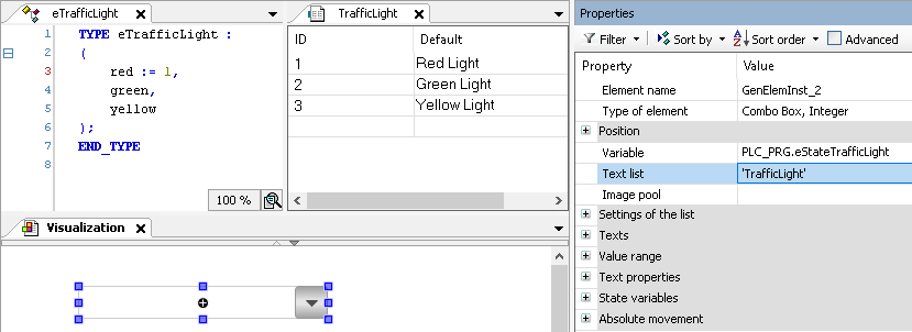
Variable | Variable to be edited via the combo box To display texts matching a list, a corresponding text list must also be configured. When an enumeration with text list support is used, no additional text list needs to be configured.
|
Text List | Name of the text list whose entries are displayed in the expanded combo box. A maximum of 32766 entries can be displayed.
|
Image Pool | Name of the image pool whose images are displayed as an entry in a combo box Example: |
TrafficLight
Settings of the list
Displayed list that expands when a visualization user clicks into the element.
Number of rows setting |
|
Count visible rows | Number of visible lines of the combo box list defined here
NoteThe property is available only when the Number of rows setting property is set to Explicit. |
Row height |
|
Height of image | Image height (in pixels) of the image displayed in the list box entry
NoteImages are displayed only when a value is specified in the Image pool property. |
Width of image | Image width (in pixels) of the image displayed in the list box entry
NoteImages are displayed only when a value is specified in the Image pool property. |
Offset of image | Makes the images in the list box appear offset (in pixels) from the left margin. An offset of
NoteImages are displayed only when a value is specified in the Image pool property. |
Scroll bar size | Size of the scroll bar (in pixels) The scroll bar is displayed when more entries are specified in the list box than in Number of visible rows. Default: |
Texts
Tooltip | String (without single straight quotation marks) Example: The text is output as a tooltip. If a placeholder |
Tip
Use the Ctrl + Enter shortcut to add a line break.
Tip
The specified texts are automatically transferred to the GlobalTextList text list. Therefore, these texts can be localized.
Value range
Limit valuerange | Requirement: A value is specified in the Text list property.
Limits the text list to one subrange. This subrange is displayed by the combo box. |
Minimum value | ID of the text list entry from which a combo box entry is displayed
|
Maximum value | ID of the text list entry up to which combo box entries are displayed
|
Filter missing textentries | Requirement: A value is specified in the Text list property.
|

Text properties
The properties get fixed values for the text properties and act on the texts configured in or .
Usage of |
|
Individual text properties | |
Horizontal alignment | Horizontal alignment of the text within the element |
Vertical alignment | Vertical alignment of the text within the element |
Font | Example: Default
|
Font color | Example: Black
|
Transparency | Integer (value range from The transparent value determines the transparency of the respective color.
Read-only transparencyThe property is read-only when the color is a style color with a predefined transparency value. |


State variables
The variables control the element behavior dynamically.
Invisible | Variable (
Example: |
Deactivate inputs | Variable (
|
Tip
The Invisible property is supported by the "Client Animation" functionality.
Center
The properties contain fixed values for the coordinates of the point of rotation. The rotation point is displayed in the editor as the  symbol and is used as the center for rotation and scaling.
Tip
You can also change the values by dragging the symbol to another position in the editor.
X | Editable X-coordinate of the point of rotation Double-clicking in the value field will open the line editor. |
Y | Editable Y-coordinate of the point of rotation Double-clicking in the value field will open the line editor. |
Absolute movement
The properties can be assigned to IEC variables for controlling the position of the element dynamically. The reference point is the upper left corner of the element. At runtime, the entire element is moved.
Movement | ||
X |
Increasing this value at runtime moves the element to the right. | |
Y |
Increasing this value at runtime moves the element downwards. | |
Rotation | Variable (numeric data type) for the angle of rotation (in degrees) Example: The midpoint of the element rotates at the Center point. This rotation point is shown as the At runtime, the alignment of the element remains the same with respect to the coordinate system of the visualization. Increasing the value rotates the element to the right. |  |
Interior rotation | Variable (numeric data type) for the angle of rotation (in degrees) Example: At runtime, the element rotates about the point of rotation specified in Center according to the value of the variable. In addition, the alignment of the element rotates according to the coordinate system of the visualization. Increasing the value in the code rotates clockwise. The rotation point is shown as the NoteIf a static angle of rotation is specified in the property, then the static angle of rotation is added to the variable angle of rotation (offset) when the visualization is executed. |  |
Tip
You can combine the variables to a Unit conversion.
Tip
The X, Y, Rotation, and Interior rotation properties are supported by the "Client Animation" functionality.
Animation
Tip
These properties are available only when you have selected the Support client animations and overlay of native elements option in the Visualization Manager.
Animation duration | Variable for the duration (in milliseconds) in which the element runs an animation
. Animatable properties
The animated movement is executed when at least one value of an animatable property has changed. The movement then executed is not jerky, but is smooth within the specified animation duration. The visualization element travels to the specified position while rotating dynamically. The transitions are smooth. |
Move to foreground | Variable (
Example: |
Input Configuration
TipThe Configure button opens the Input Configuration dialog. There you can assign follow-up actions to the event. | |
OnValueChanged | Event which triggers follow-up actions due to a change in value Which follow-up actions are triggered is configured in the Input Configuration dialog. The defined follow-up actions and the corresponding configuration are displayed below the element property. The OnValueChanged event can be disabled by the |
Permissions
Note
Available only when a user management is set up for visualization.
Access Rights button | Opens the Access Rights dialog. There you can edit the access privileges for the element. . Status messages:
|