Entries in the Visualization Style
The following describes those style entries which you as a user need to know in order to influence the appearance of the visualization or elements.
A visualization style can basically be edited with the Visualization Style Editor. You can call the editor in the Visualization Manager. If a style is preset there, then you can open the editor with that style to create a new style (derived from it). From our point of view, this is the easiest way to create your own visualization style.
Proceed as follows:
Select a visualization style which is closest to what you want.
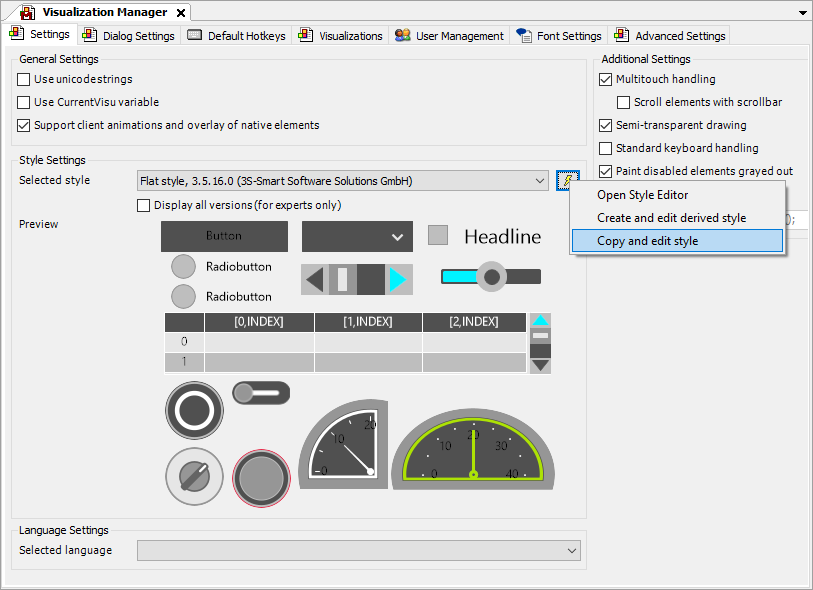
In the Visualization Manager, use the Copy and Edit Style command.
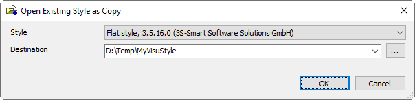
Select an empty folder, confirm the dialog, and edit the style in the Visualization Style Editor.
The Visualization Style Editor opens. The style entries can be found on the Style Propertiestab.
Use the command icon
 to toggle the insert mode.
The insert mode on the Style Properties tab is set to flat.
Important
When the insert mode is set to flat, you can apply the style entry names from the following tables.
Fonts
You can create any number of fonts with names.
These fonts can then be selected in the Visualization Element Properties in Text Properties – Font.
Style Entry | Type | Description |
|---|---|---|
Font-Standard | Font | Used in several elements as the default font setting for the font |
Font-Heading | Font | |
Tooltip-Font | Font | >= CODESYS Visualization 4.4.0.0 Used as the font for tooltips Note: Currently, only |
Colors
Colors in RGB syntax:
0x<alpha><red><green><blue>
If a description does not exist, then the name of the style entry should be self-explanatory. Any number of colors with names can be created. These colors can then be selected when a static color configuration is provided in the properties.
Style Entry | Type | Description |
|---|---|---|
Visualization-Background-Color | Color | Color for the entire background of the visualization and for filling in the isotropic view |
Dialog-ModalBackgroundColor | Color | Semitransparent color used to darken the background when a dialog is opened |
Element-Control-Color | Color | Color to fill a visualization element (Button, Table, Scroll Bar, etc.) |
Element-Control-BrightColor | Color | Color for Spin Box, Slider, and Table |
Element-Control-DarkColor | Color | Background color for Spin Box, Slider, and Table |
Element-Frame-Color | Color | Frame color of most elements |
Element-Fill-Color | Color | Fill color of elements (example: Text Field) |
Element-Background-Color | Color | Background color for Table, Alarm Table, Alarm Banner, and Text Editor |
Element-Alarm-Frame-Color | Color | Used in Button, Scroll Bar, Text Box, and Spin Box |
Element-Alarm-Fill-Color | Color | Used in Button, Scroll Bar, Text Box, and Spin Box |
Element-Alarm-Color | Color | Required for compatibility with V3.4 projects |
Element-Table-Grid-Color | Color | Used in Table |
Element-Table-SelectionColor | Color | Used in Table |
Element-GroupBox-FrameColor | Color | Used in Group Box |
BasicElement-Frame-Color | Color | Used in Rectangle, Polygon, Pie, and Line as the default color for the frame |
BasicElement-Fill-Color | Color | Used in Rectangle, Polygon, Pie, and Line as the default fill color |
BasicElement-Alarm-Frame-Color | Color | Used in Rectangle, Polygon, Pie, and Line as default alarm color for the frame |
BasicElement-Alarm-Fill-Color | Color | Used in Rectangle, Polygon, Pie, and Line as default fill color for an alarm |
Dialog-HeaderColor | Color | Used in Numpad/Keypad for the color of the header |
Dialog-ButtonColor | Color | Used in Numpad/Keypad for the color of the buttons |
Dialog-BackgroundColor | Color | Used in Numpad/Keypad for background color |
Colors without a description
This section describes the colors for individual elements. If you want to customize the colors of these elements, then the easiest way is to set the color names, install the style, and check the effect on the element within the visualization.
This section also contains style entries which are self-explanatory by name.
Style Entry | Type |
|---|---|
Element-Button-FontColor | Color |
Element-Selection-Background-Color | Color |
Element-Selection-Font-Color | Color |
Progressbar-Color | Color |
Progressbar-Frame-Color | Color |
Element-ComboArray-Selection-Color | Color |
Font-Default-Color | Color |
Font-Default-BrightColor | Color |
Element-Slider-ScaleColor | Color |
Element-ComboBoxInteger-Selection-Color | Color |
Element-Potentiometer-ScaleColor | Color |
Element-Potentiometer-LabelFontColor | Color |
Element-Meter-ScaleColor | Color |
Element-Meter-LabelFontColor | Color |
Element-Meter-ArrowColor | Color |
Element-Bar-ScaleColor | Color |
Element-Bar-GraphColor | Color |
Dialog-ScrollbarColor | Color |
Tooltip >= CODESYS Visualization 4.4.0.0 | |
Tooltip-Font-Color | Color |
Tooltip-Border-Color | Color |
Tooltip-Fill-Color | Color |
Visualization Element: Tabs | |
Element-TabControl-SecondFrameColor | Color |
Element-TabControl-BrightColor | Color |
Visualization Element: Histogram | |
Element-Histogram-Background-FirstColor | Color |
Element-Histogram-Background-SecondColor | Color |
Visualization Element: Table | |
Element-Table-ColumnHeader-Color | Color |
Element-Table-Grid-Color | Color |
Element-Table-Rows-FirstColor | Color |
Element-Table-Rows-SecondColor | Color |
Visualization Element: Scroll Bar | |
Element-Scrollbar-KnobColor | Color |
Element-Scrollbar-BackgroundClickColor | Color |
Element-Scrollbar-ScrollAreaColor | Color |
Element-Scrollbar-ButtonColor | Color |
Visualization Element: Analog Clock | |
Element-Clock-CenterPoint-Color | Color |
Element-Clock-Hands-HourHandColor | Color |
Element-Clock-Hands-MinuteHandColor | Color |
Element-Clock-Hands-SecondsHandColor | Color |
Element-Clock-Lines-Color | Color |
Element-Clock-Numerics-FontColor | Color |
Visualization Element: Date Picker | |
Element-DatePicker-MainArea-SelectedDay-FrameColor | Color |
Element-DatePicker-MainArea-SelectedDay-FontColor | Color |
Element-DatePicker-MainArea-SelectedDay-BackColor | Color |
Element-DatePicker-MainArea-OtherMonth-FrameColor | Color |
Element-DatePicker-MainArea-OtherMonth-FontColor | Color |
Element-DatePicker-MainArea-OtherMonth-BackColor | Color |
Element-DatePicker-MainArea-HeaderDay-LineColor | Color |
Element-DatePicker-MainArea-HeaderDay-FrameColor | Color |
Element-DatePicker-MainArea-HeaderDay-FontColor | Color |
Element-DatePicker-MainArea-HeaderDay-BackColor | Color |
Element-DatePicker-MainArea-CurrMonth-FrameColor | Color |
Element-DatePicker-MainArea-CurrMonth-FontColor | Color |
Element-DatePicker-MainArea-CurrMonth-BackColor | Color |
Element-DatePicker-MainArea-CurrentDay-FrameColor | Color |
Element-DatePicker-MainArea-CurrentDay-FontColor | Color |
Element-DatePicker-MainArea-CurrentDay-BackColor | Color |
Element-DatePicker-MainArea-Background-FrameColor | Color |
Element-DatePicker-MainArea-Background-BackColor | Color |
Element-DatePicker-Header-FontColor | Color |
Element-DatePicker-Header-BackgroundColor | Color |
Element-DatePicker-Header-ArrowPressedColor | Color |
Element-DatePicker-Header-ArrowColor | Color |
Visualization Element: Date/Time Picker | |
Element-DateTimePicker-SelectedCell-FrameColor | Color |
Element-DateTimePicker-SelectedCell-FontColor | Color |
Element-DateTimePicker-SelectedCell-BackColor | Color |
Element-DateTimePicker-ElemRect-BackColor | Color |
Element-DateTimePicker-Cell-FrameColor | Color |
Element-DateTimePicker-Cell-FontColor | Color |
Element-DateTimePicker-Cell-BackColor | Color |
Element-DateTimePicker-Arrow-ArrowPressedColor | Color |
Element-DateTimePicker-Arrow-ArrowColor | Color |
Visualization Element: Time Range Picker for Trend element | |
Only in | |
Element-TimeSelector-ButtonColor | Color |
Element-TimeSelector-ButtonPressedColor | Color |
Element-TimeSelector-ButtonFrameColor | Color |
| |
Element-TimeSelector-ButtonPressedFontColor | Color |
Visualization Element: Date Range Picker | |
Only in | |
Element-DateRangeSelector-ButtonColor | Color |
Element-DateRangeSelector-ArrowColor | Color |
Element-DateRangeSelector-KnobColor | Color |
Element-DateRangeSelector-KnobMarkerColor | Color |
Element-DateRangeSelector-KnobMarkerPressedColor | Color |
Element-DateRangeSelector-ScrollbarBackgroundColor | Color |
Element-DateRangeSelector-ScrollbarBackgroundColorHighlighted | Color |
Only in | |
Element-DateRangeSelector-ArrowFrameColor | Color |
Element-DateRangeSelector-ArrowPressedFrameColor | Color |
Element-DateRangeSelector-ArrowDisabledColor | Color |
Element-DateRangeSelector-ArrowDisabledFrameColor | Color |
In addition | |
Element-DateRangeSelector-ArrowPressedColor | Color |
Other, | |
Element-DateRangeSelector-ScrollbarBackgroundFrameColor | Color |
Only other | |
Element-DateRangeSelector-ScrollbarBackgroundFrameColorHighlighted | Color |
Element-DateRangeSelector-TimeScaleColor | Color |
Element-DateRangeSelector-TimeScaleFrameColor | Color |
Element-DateRangeSelector-MajorTickMarkColor | Color |
Element-DateRangeSelector-MinorTickMarkColor | Color |
Element-DateRangeSelector-TimeRangeBorderFrameColor | Color |
Element-DateRangeSelector-TimeRangeBorderColorHighlighted | Color |
Element-DateRangeSelector-ZoomOutRectangleColor | Color |
Element-DateRangeSelector-RubberRectangleColor | Color |
Other, | |
Element-DateRangeSelector-TimeRangeBorderFrameColorHighlighted | Color |
Element-DateRangeSelector-TimeRangeBorderLinesColor | Color |
Element-DateRangeSelector-TimeRangeBorderKnobColor | Color |
Element-DateRangeSelector-TimeRangeBorderKnobFrameColor | Color |
Images
Image files can be used to change the appearance of controls, such as counters, radio buttons, check boxes, lamps, and switches.
Style Entry | Type |
|---|---|
RadioButtonUnchecked | Image |
RadioButtonChecked | Image |
CheckboxUnchecked | Image |
CheckboxChecked | Image |
Additional style entries
Style Entry | Type | Description |
|---|---|---|
Style | STRING | Possible settings:
|
Textfield-Shadow | STRING |
|
Text-Margin-Horizontal | DINT | |
Text-Margin-Vertical | DINT | |
Scrollbar-Background-From-Style | DINT | For Scroll Bar:
|
Element-Meter-TransparentColor | UDINT | |
Element-Meter-Meter90-Types | STRING | Example:
|
Element-Meter-Meter90-Common-ScaleMovement | DINT | |
Element-Meter-Meter180-Types | STRING | Example:
|
Element-Meter-Meter180-Common-ScaleMovement | DINT | |
Element-Meter-Meter360-Types | STRING | Example:
|
Element-Meter-Meter360-Common-ScaleMovement | DINT | |
Element-BarDisplayImage-Types | STRING | Example:
|
Element-Potentiometer-Common-ScaleLength | DINT | |
Element-Potentiometer-TransparentColor | UDINT | |
Element-Potentiometer-Potentiometer360-Types | STRING | Example:
|
RadioButton-HorizontalAlignment | STRING |
|
RadioButton-VerticalAlignment | STRING |
|
Checkbox-HorizontalAlignment | STRING |
|
Checkbox-VerticalAlignment | STRING |
|
ComboBoxInteger-HorizontalAlignment | STRING |
|
ComboBoxInteger-VerticalAlignment | STRING |
|
ComboBoxInteger-ImageHeight | DINT | |
ComboBoxInteger-ImageWidth | DINT | |
ComboBoxInteger-ImageOffset | DINT | |
ComboBoxInteger-HeightRows | DINT | |
ComboBoxInteger-VisibleRows | DINT | |
DropDown-Button-UseScrollbarSize | DINT | With this setting, the button of the combo box will be drawn with the same width as the scroll bar of the combo box. 1: 0: |
DropDown-SingleBoxColor | DINT | With this setting, no button will be drawn. The combo box element uses a single color for the entire field. Flat style
Note: This setting is used only in the standard styles: Standard, Basic, Flat, and White. The selection color used for the flat style button is now used for the arrow. |
SpinControl-HorizontalAlignment | STRING |
|
SpinControl-VerticalAlignment | STRING |
|
Element-Switch-TransparentColor | UDINT | |
Element-Switch-DipSwitch-Types | STRING | Example:
|
Element-Switch-RockerSwitch-Types | STRING | Example:
|
Element-Switch-RotarySwitch-Types | STRING | Example:
|
Element-Switch-PowerSwitch-Types | STRING | Example:
|
Element-Switch-PushSwitch-Types | STRING | Example:
|
Element-Switch-PushSwitchLed-Types | STRING | Example:
|
Element-Switch-PushSwitch-UsePushedImage | STRING |
|
Element-Switch-PushSwitchLed-UsePushedImage | STRING |
|
Element-Switch-PowerSwitch-UsePushedImage | STRING |
|
Element-Lamp-TransparentColor | UDINT | |
Element-Lamp-Lamp1-Types | STRING | Example:
|
TabControl-HorizontalAlignment | STRING |
|
TabControl-Frame-Border | DINT | |
TabControl-Text-Frame-Border | DINT | |
GroupBox-Text-Frame-Border | DINT | |
Button-Image-Frame | DINT | |
Button-Absolut-TextOffset-Left | DINT | |
Button-Absolut-TextOffset-Right | DINT | |
Button-Absolut-TextOffset-Top | DINT | |
Button-Absolut-TextOffset-Bottom | DINT | |
Checkbox-Framesize | UDINT | |
RadioButton-Framesize | UDINT | |
RadioButton-Rowheight | UDINT | |
Element-ComboArray-HeightBox | DINT | |
TabControl-Frame-Border | DINT | |
TabControl-Text-Frame-Border | DINT | |
TabControl-TabHeight | DINT | |
Element-Meter-Meter90-Common-UnitOffset | DINT | |
Element-Meter-Meter90-Common-ScaleLength | DINT | |
Element-Meter-Meter90-Common-OriginOffsetFactor | DINT | |
Element-Meter-Meter90-Common-NeedleMovement | DINT | |
Element-Meter-Meter90-Common-LabelOffset | DINT | |
Element-Meter-Meter360-Common-UnitOffset | DINT | |
Element-Meter-Meter360-Common-ScaleLength | DINT | |
Element-Meter-Meter360-Common-OriginalOffset | DINT | |
Element-Meter-Meter360-Common-NeedleMovement | DINT | |
Element-Meter-Meter360-Common-LabelOffset | DINT | |
Element-Meter-Meter180-Common-UnitOffset | DINT | |
Element-Meter-Meter180-Common-ScaleLength | DINT | |
Element-Meter-Meter180-Common-OriginOffsetFactor | DINT | |
Element-Meter-Meter180-Common-NeedleMovement | DINT | |
Element-Meter-Meter180-Common-LabelOffset | DINT | |
Element-Potentiometer-Common-UnitOffset | DINT | |
Element-Potentiometer-Common-ScaleMovement | DINT | |
Element-Potentiometer-Common-OriginalOffset | DINT | |
Element-Potentiometer-Common-NeedleMovement | DINT | |
Element-Potentiometer-Common-LabelOffset | DINT | |
Dialog-UseHeaderColor | DINT |
|
Visualization Element: Analog Clock | ||
Element-Clock-Positioning-HandSizeFactor | UDINT | |
Element-Clock-Positioning-LineMovement | UDINT | |
Element-Clock-Positioning-NumericMovement | UDINT | |
Element-Clock-Type-Fallback | STRING | Example:
|
Element-Clock-Types | STRING | Example:
|
Visualization Element: Date Picker | ||
Element-DatePicker-MainArea-SelectedDay-ShowFrame | UDINT | |
Element-DatePicker-MainArea-SelectedDay-ShowBack | UDINT | |
Element-DatePicker-MainArea-SelectedDay-RectType | UDINT | |
Element-DatePicker-MainArea-SelectedDay-LineWidth | UDINT | |
Element-DatePicker-MainArea-OtherMonth-ShowOtherM | UDINT | |
Element-DatePicker-MainArea-OtherMonth-ShowFrame | UDINT | |
Element-DatePicker-MainArea-OtherMonth-ShowBack | UDINT | |
Element-DatePicker-MainArea-OtherMonth-RectType | UDINT | |
Element-DatePicker-MainArea-OtherMonth-LineWidth | UDINT | |
Element-DatePicker-MainArea-HeaderDay-ShowLine | UDINT | |
Element-DatePicker-MainArea-HeaderDay-ShowFrame | UDINT | |
Element-DatePicker-MainArea-HeaderDay-ShowBack | UDINT | |
Element-DatePicker-MainArea-HeaderDay-RectType | UDINT | |
Element-DatePicker-MainArea-HeaderDay-LineWidth | UDINT | |
Element-DatePicker-MainArea-HeaderDay-HeaderLineWidth | UDINT | |
Element-DatePicker-MainArea-CurrentMonth-ShowFrame | UDINT | |
Element-DatePicker-MainArea-CurrentMonth-ShowBack | UDINT | |
Element-DatePicker-MainArea-CurrentMonth-RectType | UDINT | |
Element-DatePicker-MainArea-CurrentMonth-LineWidth | UDINT | |
Element-DatePicker-MainArea-CurrentDay-ShowFrame | UDINT | |
Element-DatePicker-MainArea-CurrentDay-ShowBack | UDINT | |
Element-DatePicker-MainArea-CurrentDay-RectType | UDINT | |
Element-DatePicker-MainArea-CurrentDay-LineWidth | UDINT | |
Element-DatePicker-MainArea-Background-ShowBack | UDINT | |
Element-DatePicker-Header-ShowBackground | UDINT | |
Element-DateTimePicker-SelectedCell-ShowFrame | UDINT | |
Element-DateTimePicker-SelectedCell-ShowBackground | UDINT | |
Element-DateTimePicker-SelectedCell-RectangleType | UDINT | |
Element-DateTimePicker-SelectedCell-FrameWidth | UDINT | |
Element-DateTimePicker-ElementRect-ShowBackground | UDINT | |
Element-DateTimePicker-Cell-ShowFrame | UDINT | |
Element-DateTimePicker-Cell-ShowBackground | UDINT | |
Element-DateTimePicker-Cell-RectangleType | UDINT | |
Element-DateTimePicker-Cell-FrameWidth | UDINT | |
Element-DateTimePicker-Arrow-ShowArrow | UDINT | |
Visualization Element: Scroll Bar | ||
Scrollbar-Background-From-Style | DINT | |
Element-Scrollbar-OnlyKnob | DINT | The new appearance for the scroll bar has been implemented for the following styles:
The new scroll bar then does not have any up/down/left/right scroll buttons. Moreover, there is no label on the knob. The knob is wider/higher than the background of the scroll bar. The width/height of the scroll bars preset in the properties gives the width/height of the knob. Note: The new appearance can be enabled by setting |
Element-Scrollbar-Knob-RoundRectRadius | DINT | |
Element-Scrollbar-Knob-FixedLength | DINT | |
Tooltip | ||
Tooltip-Border-Width | UDINT | |
Visualization Element: Rectangle | ||
Visualization Element: Rounded Rectangle | ||
Element-RoundRect-Radius | DINT | The radius of the rounded rectangle |
Visualization Element: Histogram | ||
Element-Histogram-Opaque-Background | STRING |
|