Toplevel templates
A toplevel template is a template for the start page of the generated visualization. It contains a frame as a placeholder for the user specific pages and tabs to switch to the different pages. Optionally there are buttons to navigate to the pages and a status and address line. The toplevel template can be selected in the settings of the Visualization generator.
The AC_ModuleBase library which is part of the standard installation of CODESYS Application Composer contains three toplevel templates: AC.GenVisu_Toplevel_Template, AC.Toplevel_Vertical_Template, and AC.Toplevel_3S_Vertical_Template.
AC_Toplevel_3S_Vertical_Template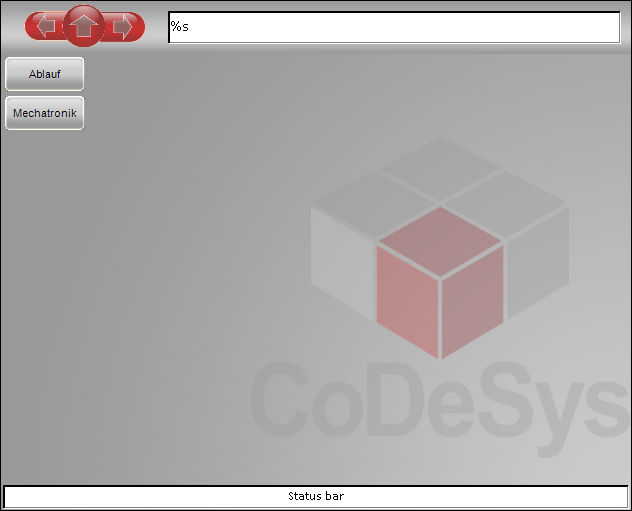
Besides the prepared templates it is also possible to create user defined toplevel templates.
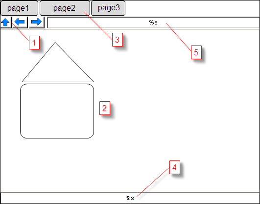
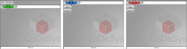
(1): Navigation: Up / Back / Forward
(2): Frame to display pages
(3): Tab for direct navigation to toplevel pages
(4): Status line
(5): Address line: Instance path of the displayed modules instance
The elements of the visualization template are identified by their element names. In the list below the name of the elements is written in brackets.
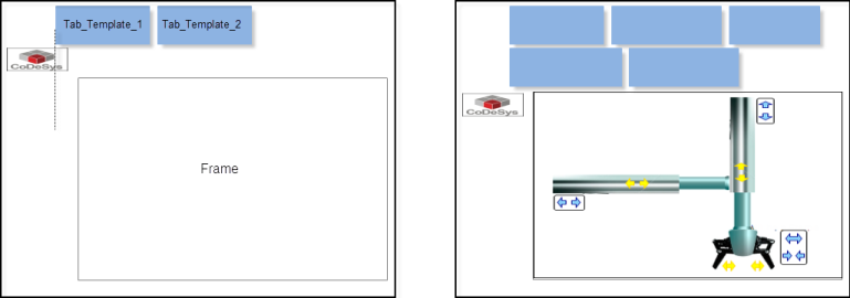
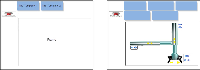
[Frame]: Main frame which displays the visualization pages. For best results the scale type of the frame should be set to "isotropic".[Tab_Template_1],[Tab_Template_2]: Two elements which are used for the look and arrangement of all tabs. Tab_Template_1 defines the position of the first tab and the appearance of all tabs. From the position of Tab_Template_2 the arrangement of the tabs (horizontal or vertical) and the gap between the tabs will be calculated. The alarm color will be set if the hierarchy of the displayed page is below the instance represented by the tab. If the element is a button, the button state variable will also be set. If the element is a frame the alarm color will not be used. Instead of this the switch frame variable will be set to "1", if the tab is selected (default 0).
[Up],[Back],[Forward]: Elements for navigation which can be a button or a frame. The element type can be a button or a frame. In case of a frame, the frame must contain three visualizations which must be in the following order: Neutral, Pressed, Deactivated.[Address]: Text field which outputs the instance path of the displayed module instance.[Status]: Text field which displays the content of the global string variableac.g_stVisuStatusBarfrom the library AC_ModuleBase. This variable can be used in own module implementations to display the state of a variable.
All other elements are not especially handled by the visualization generator. For the generation, the template visualization copies and modifies the copy. The original is not changed.
With the exception of the visualization elements mentioned above, the visualization generator tries not to change any elements which have been changed by hand. At the first visualization generation, the described visualization template is copied. This copy, as long as it is not deleted by the user, will only be modified in future generation runs and not recopied. This is done by treating a toplevel visualization of an earlier generator run as if it is a new visualization template (the original template is never be changed), although it is not copied. So, if there are additional tabs these tabs will be added to the already existing tabs. All other properties and elements will not be touched if possible so that buttons, tabs, etc., which have been added manually by the user will maintain their positions.
Tip
Deleting e.g. navigation buttons results in a loss of them. To generate those, the toplevel visu has to be deleted and regenerated
Alignment of the tabs
The tabs will be aligned horizontally from left to right or vertically top down. The relative position of the template element Tab_Template_1 and Tab_Template_2 defines the alignment: If the vertical distance of the elements is greater than the horizontal distance, the elements will be aligned horizontally, otherwise vertically.
In case of vertical alignment, all tabs get the same width, which is the minimum width that all tab names can be displayed. In the case of a horizontal alignment, each tab gets the minimum width which can display its name. In both cases the height of the tabs will be set to the height of the first template (Tab_Template_1).
For the placement, the first template is copied and adapted for each tab.
The placement starts at the position of the first template – the distance between two tabs results from the horizontal or vertical distance between the two templates. This distance can also be negative, in which case the following tab overlaps the previous one and paints over it because it is further forward. In the case of vertical alignment, the generation is aborted with an error if there is not enough space downwards to accommodate all tabs. No second column of tabs is created. In case of horizontal alignment, a new row will be created if the next tab no longer fits horizontally in the visualization. If that happens for the first tab of a line, then the generation is aborted with an error.
It can happen that there is not enough space for the tab. In the case of horizontal alignment, this happens when wrapping to a new line. When aligned vertically, it happens when the width of the tabs is greater than the space provided for them in the template. In these cases, an attempt is made to create more space. Due to this automatic alignment of the elements there are four possible cases to arrange the tabs:
Horizontal alignment of tabs: All tabs must be completely above the frame
Horizontal alignment of tabs: All tabs must be completely below the frame
Vertical alignment of tabs: All tabs must be completely on the left side of the frame
Vertical alignment of tabs: All tabs must be completely on the right side of the frame
If the alignment of the tabs mismatch the restriction above an error message will be created.
If there is not enough space for the tabs, then the frame is reduced accordingly. All elements between tabs and frame are moved. A position of an element is interpreted as "between tabs and frame" if it is not completely outside of the outer limit of the first tab template (see examples for horizontal arrangement below).
The creation of the visualization will be aborted if the modification of the size of the frame would lead to negative values.